Wednesday, October 20, 2010

3D Max Name & Animation

Today in 3d max we have learned how to write our names in 3D and apply a large variety of textures, it was quite a simple thing to do, First of all you click the create button and instead of being on geometry you click on the shapes on the right of that, Then click on splines then text and write in the text you wish to put below.


When you have written the text you want to make it into a 3D text you must go on modify you then right click were it says text and convert into an editable mesh then click polygons and highlight the whole text then extrude as far as you want it to be to make it 3D then you can click the "m" key on your keyboard to go to material editor to change the colours of the text.


With the material editor I changed a lot of things with my text i went on to diffuse which is the colour you can change that and the specular level and glossiness to make the colour a bit better then you can click the little box next to the diffuse which is where you can change multiple things. there are various different styles to choose from i chose the planet button and played about with all the colours to get it to what i have now which i think is a very good text.
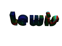


As you can see there are many different colours all mixed in this text in fact there are 8 different colours mixed into this and there all different shades/colours which gives it this effect i think its very fancy and my sort of style i only did two texts because i took alot of time doing this text to the best i could get it to my image.
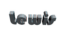


This text is a lot more simple i used the marble texture for this and then changed the vein width of this and made the lines thinner and more of them so its aqua with red lines through its simple but effective and i think its good.


After we did the text we learnt how to do animation you have to click auto key and highlight the object you want to move to make it animate so i made my text move around circle and go smaller and larger and made a simple animation then rendered this short seconds movie and saved it, Below is the video i made.

Then we did another animation which i made my car move and the ball bouncing as well as this to make two things in one animation the ball bounces off the car.

Tuesday, October 19, 2010

Finished Desktop Project


This is my finished desktop that ive done it took me a long time to get to this point i first drew the design of this dragon on paper the concept of it i then added the flames later on deciding it would be a good touch and add a little uniqueness to the design.
After this i shaded in the bits like the mouth shaded in the horns and neccisary bits, Then i photographed the piece of paper i drew on then transfered it to the computer and opened it on photoshop to tweek things on it.
I coloured it in in differant shades some brighter green whilst other bits duller whilst the flame being light orange to dark orange. the tongue is also purple and the teeth has red in the tips of some of the teeth which is meant to be blood, I found a decent brush on photoshop for the background smoke style and another sparks one around the flames.
I then made it poster edges made the thickness to the top and other things to make it more detailed and thicker edges and made it look alot more like a comic book style because i love this style, it looks amazing i like the style so i chose to make it look more like a comic book. I then got my fonts from 1001 fonts for the media suite which i placed into the flames of the dragon.
After this i got another font for all the college regulations, Then copied the shipley college logo and placed it under the dragon on the bottom left, placed the icons around the fire like an aura.
I think that my desktop project came out really good infact probably better than i thought it would i think its appropriate for the age and gender and has no offensive content in this and has nothing inappropriate.

Wednesday, October 13, 2010

3D Max 13/10/10

We do 3d max tutorials every wednesday of the week at college and we learn new things each time getting abit more experiance each time this week we had to transform just a simple box into a car it took alot of tweeking but it was possible to do, we first converted the box into an editable mesh after making edges faces we then used the vertex's to change some of the points on the box to make it invert into the side to make more use of the box to make it look more like a car.
Then some of the polygons i moved them up and down until i felt that it looked what i wanted it to look like it took a little tweeking to do but eventually got it to my standard i wanted it to be at. below is the picture of the finished product i did on 3dmax this week.


This is a proffesional version of the 3d car model lamborghini i tried to create mine was nowere near as good as this but i gave it a try i need more experiance on 3dmax before i can do something nearly as good as this. i have now decided that my creation is more like a hummer so im going for that instead.

Thursday, October 7, 2010

Logos


This is the logo for god of war i think it is a really attractive logo bright colours appealing for the end of a trailer for the game with the dark clouds in the background also to make it more of a gloomy atmosphere its overall a brilliant logo.


This is the logo for the famous designer of clothes giorgio armani, this is a brilliant logo you can tell its been photoshopped, its also mirrored and reflected so you can see the name asif its reflecting too which is an amazing effect to have.


This is the logo for the newest halo game, Halo Reach which has sold millions world wide, i like this logo because it fits in with the atmosphere of the game which is a sci-fi game basically because it is set on a differant planet than earth, i love the effects in this logo the way it fades and the glowing edges makes it look a very clean and more than presentable logo.

Graphic Styles I Like

This is from heroes the TV show but they have created a graphic novel about it because the show was so successful they made more this to make more money from it, i love this graphic style its very realistic looks like they have used pastels and chalk, it has come out brilliantly but i do like this style quite alot.


This is from a comic book it is similar to the project im working on at the moment for my desktop background which is comic style and this is what i will be aiming for this kind of style of design i like the bright colours involved in it


Tuesday, October 5, 2010

Desktop Backgrounds


These are my 4 original ideas for my desktop background that i will create we have drawn 4 initial ideas we think would be good ideas and in the end choose 1 main idea to use for your desktop background and enhance it.

1.The first design on the top left is a dragon i have drawn as details as i can with flames coming from his mouth inside the flames will have media suite in it, and the picture will take up a reasonable amount of room on the desktop with the shipley college logo being in the top right and the icons at the left hand side or possibly used for the scales on the dragon.

2. The second design is on the top right which is a sword i have drawn this is more simple than the design before it is a magical sword and there is an aura around the sword and the icons are surrounding the sword which would be the icons.

3. The third design is another simple design which is a race track from formula one not as well detailed as that because i dont think i would use this idea other the other 3 , i would use the icons as the cars as a birds eye view.

4. The Forth design is a pacman map but not as detailed as the actual official pacman map but its just like it, ive done this as like pacman in the map with some ghosts and the icons are what pacman eats to get points.

The Idea i will chose is the first idea with the dragon in it i will photoshop it some more so its more detailed and looks alot better.